Selecting the perfect color for handmade furniture is more than just a matter of taste; it is a strategic decision that can transform the atmosphere and function of your living space. With the rise of personalized, artisanal furnishings, choosing the right hue becomes even more significant, as it directly reflects your personality, complements your décor, and enhances the value of your investment. Whether you are commissioning a custom dining table or searching for the ideal finish for a handcrafted bookshelf, understanding the principles behind color selection will ensure your furniture blends seamlessly with your home — or stands out exactly as you intend.
The Psychology of Color in Handmade Furniture
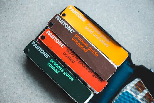
Color is a powerful communicator. Studies show that colors can influence mood, perception, and even behavior within a space. For example, a 2020 survey by the Pantone Color Institute found that 61% of respondents associated blue with calmness and tranquility, while 52% linked red to energy and excitement. When choosing a color for your handmade furniture, consider the psychological effect you want to achieve in each room.
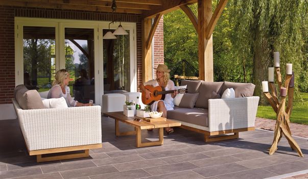
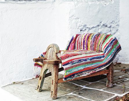
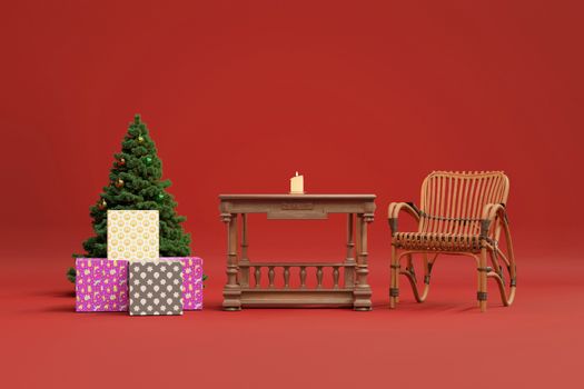
- $1 Reds, oranges, and yellows evoke warmth, energy, and sociability. A handmade cherrywood dining table finished with a deep red stain can stimulate conversation and appetite, making it ideal for communal areas. - $1 Blues, greens, and purples promote relaxation and focus. A custom bookshelf in a muted sage green can create a serene reading nook. - $1 Whites, greys, and natural wood finishes offer versatility and timelessness. An oak coffee table with a clear finish can adapt as your style evolves.According to a 2023 trend report from Houzz, neutral and earth-tone finishes on handcrafted pieces have surged in popularity, with 46% of new buyers preferring these shades for their calming effect and flexibility.
.png)
Assessing Your Space and Lighting Conditions
The same color can look dramatically different depending on a room’s size, natural light, and existing palette. Before selecting a finish for your handmade furniture, evaluate the environment where it will reside.
- $1 South-facing rooms with abundant sunlight can handle bolder colors, while north-facing spaces benefit from lighter, warmer hues to compensate for cooler light. - $1 Dark tones can make a small room feel even smaller, but they add coziness to larger spaces. Conversely, lighter shades can open up compact areas. - $1 Take stock of wall colors, flooring, and other prominent furniture pieces. Repeating an accent color from another part of the room can unify your design, while a contrasting hue can create an eye-catching focal point.A study by the American Society of Interior Designers found that 72% of homeowners who considered lighting and space before choosing furniture color were more satisfied with their purchase after one year.
Choosing a Color Scheme: Harmonious vs. Contrasting
Selecting a color for handmade furniture isn’t just about picking your favorite shade; it’s about integrating the piece into your home’s overall color scheme. Two popular approaches are:
- $1 These use similar or adjacent colors on the color wheel (e.g., blues and greens). Harmonious schemes are calming and cohesive—ideal for bedrooms or minimalist interiors. - $1 These rely on complementary colors (e.g., blue and orange, red and green) for vibrancy and drama. Contrasting pieces work well as statement items, such as a bold turquoise console table in a neutral entryway.Here’s a comparison of the two approaches:
| Scheme Type | Color Choices | Best For | Effect |
|---|---|---|---|
| Harmonious | Adjacent on wheel (e.g., blue + green) | Serene, cohesive spaces | Calming, unified look |
| Contrasting | Opposite on wheel (e.g., blue + orange) | Focal points, eclectic rooms | Dynamic, eye-catching |
Interior designers often recommend using the 60-30-10 rule: 60% of the room is a dominant color, 30% a secondary color, and 10% an accent. Handmade furniture can serve as either the secondary or accent hue, depending on your scheme.
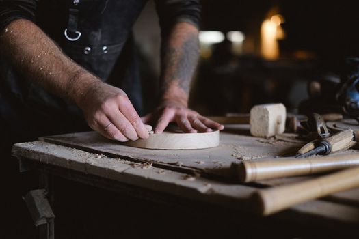
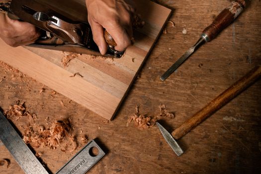
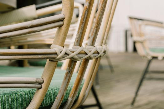
Material Matters: How Wood Type Influences Color Choices
The underlying material of your handmade furniture can dramatically affect how a color or finish appears. Hardwood species such as oak, walnut, and maple each have unique grain patterns and natural tones that interact differently with stains and paints.
- $1 These take stains evenly and can be finished in both light and dark shades. They’re ideal for painted finishes or translucent stains that highlight the grain. - $1 Best suited to clear or lightly tinted finishes that showcase their rich, natural color. Dark stains on dark wood can sometimes appear flat or muddy. - $1 Pine is prone to blotchiness with some stains but can be beautiful when painted or finished with a light, transparent wash.For example, a 2022 survey conducted by the National Wood Flooring Association indicated that 58% of consumers preferred finishes that allow the natural grain to show through, especially on high-end, handcrafted pieces. Your choice of color should enhance rather than obscure the wood’s character.
Personal Expression and Trends: Balancing Timelessness and Style
While it’s tempting to follow the latest color trends, remember that handmade furniture is an investment meant to last for decades. Color trends can change rapidly—Pantone’s Color of the Year for 2023 was Viva Magenta, while 2024’s is a soft Peach Fuzz—but your furniture should reflect your own taste and the long-term vision for your home.
- $1 Natural wood finishes, whites, greys, and deep blues rarely go out of style and are easy to adapt to changing décor. - $1 Consider using trendier colors on smaller, less expensive pieces such as side tables or stools, which are easier to repaint or refinish. - $1 Handmade furniture offers the unique opportunity to incorporate a signature color or custom shade that’s meaningful to you, making the piece truly one-of-a-kind.In 2023, 41% of custom furniture buyers reported choosing a color based on personal significance—such as a shade reminiscent of a childhood home or favorite vacation spot—underscoring the emotional connection people have with their living spaces.
Practical Considerations: Maintenance and Durability of Color Finishes
Beyond aesthetics, it’s essential to consider the practical aspects of color choice. Some finishes are more forgiving of daily wear, spills, and sun exposure than others.
- $1 These can show dust, fingerprints, and scratches more easily, especially on high-gloss surfaces. - $1 While they brighten a space, very pale finishes may be prone to staining or yellowing over time. - $1 Oil-based finishes tend to amber with age, while water-based finishes remain clearer but may not offer the same depth or warmth. For painted pieces, opt for high-quality paints formulated for furniture, topped with a clear protective coat.A Furniture Industry Research Association report found that regularly used pieces (like dining tables) with water-based polyurethane finishes retained their original color 20% longer than those finished with oil-based alternatives in direct sunlight.
Final Thoughts: Making the Right Color Choice for Your Handmade Furniture
Choosing the right color for your handmade furniture is a blend of art and science. By considering the psychology of color, the unique qualities of your space, the material of your furniture, and your own personal style, you can select a hue that enhances your home for years to come. Remember to factor in practical considerations like maintenance and durability, and don’t be afraid to let your personality shine through—after all, the beauty of handmade furniture lies in its individuality.
When in doubt, consult with a professional furniture maker or interior designer. Many artisans offer color samples or can create custom finishes to help you visualize the final result. With thoughtful planning and attention to detail, your handmade furniture will become a cherished centerpiece in your home.